Ket’s Balloon koncepts
Rebranding Work
Ket’s Balloon Koncepts (K.B.K for short) is based in London, United Kingdom, specialising in custom balloons with tailored colour palettes. “They inspire the creativity in you. Whether you have a beer or rosé budget, they still ensure you will have a champagne-popping event.”
This work aimed to revamp the existing brand identity for Ket’s Balloon Koncepts. The client sought a fresh perspective on her branding.
The brief indicated that the client desired a professional yet approachable brand identity.
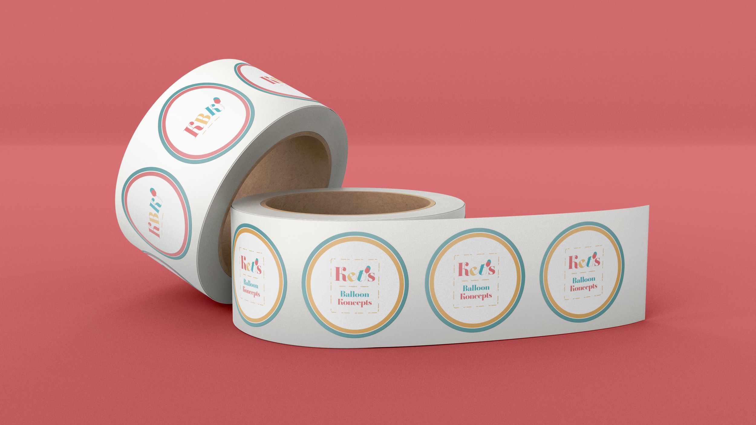
The brand logo is a font logo with two balloons acting as the apostrophe, and the misplacement of the letters is to symbolise bouncing balloons. The font used for the new brand identity is called Amberoise Std, and the weight of the font is set to Extra Bold. The colour palette for the brand is pastel texture colours, inspired by balloons when they stretched.
Uniform
A Uniform helps the brand stand out it makes the brand distinguish and easily recognisable. The uniform gives the brand a proud feeling and a good impression to potential clients. With the presence of a person in uniform, it can change the mood of people around.
The uniform of ‘Ket’s Balloon konceptse,’ is a white polo shirt with the brand colours on the sleeves, the polo shirt can be worn with any trousers.


